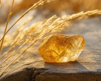
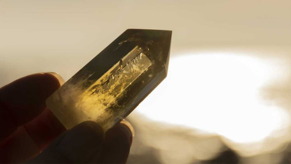
There’s a reason people keep searching citrine color and then second-guessing what they’re seeing. Citrine isn’t one single, fixed yellow. It’s a whole spectrum of warmth—sometimes buttery and soft, sometimes honeyed and deep, sometimes almost champagne-clear until the light hits it just right.
And if you’ve ever felt thrown off by that—like you should “know” what you’re looking at, but the photos online don’t match what’s in your hand—you’re not alone. Color is one of the fastest ways our nervous system makes sense of the world. It’s instant. It’s sensory. It lands in the body before it becomes a thought. So when the color of a stone feels confusing, it can quietly create that same internal wobble: Am I seeing this correctly? Am I choosing the right thing?
This article is here to settle that wobble.
Not by turning citrine into a rigid checklist—but by giving you a grounded, human way to understand the shades citrine can show, what they often symbolize, and how to choose a tone that actually fits the emotional mood you’re trying to live in. If you’re drawn to citrine because you want something brighter in your life—more energy, more confidence, more steadiness, more warmth—then it makes sense that the color matters. It’s the part you feel first.
We’ll talk about the range of citrine shades, why lighting and photography make it so hard to compare, and how color symbolism can be useful without turning into pressure. We’ll also touch gently on the difference between “this is the shade I’m drawn to” and “this is the shade I think I’m supposed to buy.” Those are not the same. And if you’ve had experiences where you were taught to doubt your own perception, choosing by color can become a surprisingly tender practice of self-trust.
If you want a broader grounding in what this stone is overall, treat it like your home base: citrine.
What Citrine Color Really Looks Like (and Why Photos Can Feel So Misleading)
Citrine is typically recognized as yellow-to-golden quartz, but that simple sentence doesn’t capture what your eyes actually encounter. In real life, citrine can look pale and nearly transparent in shade—then suddenly warm and radiant in sunlight. It can shift from “barely there” to “glow” depending on time of day, indoor bulbs, the color of your walls, even the tone of your skin behind it.
This is why comparison shopping can feel quietly stressful. You’re not just picking an object—you’re trying to match a felt sense. And photos don’t cooperate. Cameras often exaggerate saturation or flatten depth. Some images are edited to appear more “golden,” while others are backlit in a way that turns the stone into a silhouette. Even two photos of the same crystal can look like different stones.
If you’ve ever felt that mini spiral of, Did I choose wrong?—that’s not you being “too sensitive.” That’s your nervous system responding to uncertainty. The body likes clarity. When clarity is missing, it creates alertness. And in an online world where everything is filtered and optimized, it’s easy to believe the confusion is your fault.
A steadier approach is to stop asking, “What does citrine look like online?” and start asking, “What does this shade do to me in real life?” That’s the more reliable metric—especially if you’re drawn to stones for emotional or spiritual reasons. You can explore that deeper layer through citrine crystal meaning if you want the energetic lens alongside the visual one.
Also: lighting isn’t just a technical detail—it changes meaning. A stone that looks “too pale” in cloudy light may feel quietly reassuring on days when your system is already overstimulated. A stone that looks boldly golden in direct sun can feel motivating when you’re ready to take up more space. The same crystal can meet you differently on different days. Let that be allowed. A crystal doesn’t have to perform one fixed identity to be real.
If you’re someone who benefits from practices that keep you in your body while you decide, you might pair this with a gentle pause from mindfulness for beginners—not to overthink the stone, but to come back to what you actually feel.
For now, let’s anchor on this: citrine color is a range, and your relationship with that range can be intuitive, practical, and emotionally grounded all at once.
Citrine Color Spectrum: Pale to Deep Golden (and What Each Shade Can Signal)
Think of citrine as living somewhere on a warm gradient. Instead of searching for one “correct” shade, it helps to know the most common tones people encounter and what they often represent in color symbolism. Not as rigid rules—more like emotional weather reports.
Pale yellow / champagne citrine tends to feel airy and gentle. People often describe this tone as calming, clean, and understated—like sunlight through curtains rather than sunlight on bare skin. If you’re in a season where you’re recovering, rebuilding, or trying not to overwhelm yourself, lighter tones can feel supportive. They don’t demand intensity. They offer quiet warmth. For some readers, this shade feels like “permission to be soft” rather than “pressure to be bright,” and that distinction can matter more than any label.
Lemon yellow often reads as bright, clear, and optimistic. It can feel like fresh start energy—mentally clarifying, emotionally uplifting, and a little more outward-facing. This is a shade people gravitate toward when they’re trying to reconnect with confidence after a dim season. It’s the kind of yellow that says, “I can try again,” without needing the whole life overhaul to happen overnight.
Golden yellow / honey tones are where citrine starts to feel undeniably sun-like. This shade range often symbolizes steady self-worth, grounded joy, and a sense of fullness. It can feel less like a spark and more like a sustained flame—warmth you can build a life around. If you’ve spent years bracing, people-pleasing, or shrinking to stay safe, honey-gold tones can feel like a quiet reclamation: “I’m allowed to take up room.” If you’re working with that reclaiming energy in a body-first way, it can help to have a steady emotional foundation like emotional wellness foundations alongside your spiritual tools.
Deep gold / amber-leaning citrine can feel richer, heavier, and more anchored. Some people experience these tones as protective—not in a defensive way, but in a contained warmth way. If bright colors make you feel exposed, deeper gold can feel safer, like warmth with boundaries. This shade can feel especially appealing when you want confidence without the “perform” energy that sometimes comes with high brightness.
And then there’s the reality: sometimes a stone has zones—pale edges with a honey center, or subtle smokier inclusions that add depth. Those variations are not flaws. They’re part of how natural materials carry character. If you’re choosing wearable pieces, those shifts can also create dimension that looks different from every angle, which can feel more personal than a perfectly uniform color.
If you want to connect these shades to how you actually wear and live with the stone—especially in jewelry—this lens can support you: citrine jewelry meaning.
Citrine Color Meaning: When Symbolism Helps (and When It Turns into Pressure)
Color symbolism can be a beautiful language—until it becomes a test you feel like you might fail.
A lot of people come to citrine because they want something specific: abundance, confidence, courage, vitality, hope. And it’s tempting to treat the “right” shade as the key that unlocks the result. But if you’ve lived through experiences where you had to perform correctness to feel safe—where being wrong meant disconnection—then shopping by symbolism can quietly recreate that emotional pressure.
Here’s a gentler truth: color meaning is most helpful when it supports your lived reality, not when it overrides it.
If pale citrine feels like relief, that matters. If honey gold feels like a steady yes in your body, that matters. Your nervous system’s response is not random; it’s information. Sometimes the shade you’re drawn to is the shade that matches what you’re ready for. Sometimes it’s the shade that offers what you’ve been missing: steadiness, warmth, or simply a softer pace.
This is also where intention comes in—not as hustle, but as clarity. Some people hold citrine as a reminder that they’re allowed to want good things. Others use it as a symbol of courage while rebuilding after burnout. Others want a stone that feels like warmth without chaos. If you’re exploring that kind of relationship with citrine, a practical doorway is citrine uses.
And if your interest is specifically tied to money, stability, or success, the emotional texture is often complicated: hope braided with worry, desire braided with shame, longing braided with the fear of disappointment. In that case, this topic can feel grounding rather than hyped: citrine for abundance.
One more important note: if you’ve ever been shamed for what you want, you might notice yourself minimizing your preferences—choosing the “more reasonable” shade instead of the one you love. That’s not a style issue. That’s a self-trust issue wearing a style costume. You don’t have to force yourself into a “spiritual” version of scarcity. You’re allowed to choose what feels nourishing. You’re allowed to choose what feels like home inside your own body.
If you want to keep your practices nervous-system-aware while you work with symbolism, it can help to pair your rituals with gentle regulation tools like conscious breathing—not to “fix” your feelings, but to make room for them.
Choosing Citrine by Color: Shopping, Styling, and Feeling Safe in Your Choice
Once you understand the color range, the next question becomes practical: How do I choose a citrine color that fits my life?
Start with where you’ll use it.
If you’re choosing jewelry, consider the metals and tones you already wear. Citrine’s warmth tends to harmonize beautifully with yellow gold, but it can also look striking in silver when you want the brightness to stand out. A helpful way to choose is to picture your most common day: your usual light, your usual clothing, your usual mood. In other words, choose for your real life, not the fantasy version where you’re always in perfect sun and linen. If you want to browse in a way that makes color comparison feel simple, you can start with citrine jewelry.
If you wear bracelets often, color reads differently because it sits near your skin and moves through different lighting all day. A lighter citrine can look delicate and airy; a honey-gold bracelet can look like steady warmth you carry everywhere. If that’s the form you reach for most, you can explore citrine bracelets and notice what your eyes keep returning to when nothing is trying to convince you.
If necklaces are more your style, the tone often feels closer to your emotional center—near the place many people feel grief, longing, love, and voice. Sometimes the “right” shade is simply the one that makes your chest feel less tight. If you want to see how citrine reads near the face and heart, start with citrine necklaces.
If your relationship with citrine is more ritual-based, color choice can be about the emotional state you’re trying to cultivate. Lemon tones might feel like momentum. Honey tones might feel like steadiness. Deeper gold might feel like contained warmth. And if your intentions lean toward growth and courage, this approach can help you translate wanting into grounded practice: citrine for manifestation.
You can also choose by chakra association if that language is meaningful to you. Many people connect citrine with personal power and self-worth. That can be helpful as long as it stays gentle: a map, not a mandate. If you want that map without turning it into pressure, you can explore citrine chakras with the same softness you’d use when listening to your own body.
And if you’re someone who needs your spiritual tools to be trauma-informed—meaning they support your body’s sense of safety—it can help to ground your relationship to crystals through broader frameworks like gemstone meanings and crystals by intention, because it keeps the focus on lived needs, not aesthetic pressure.
Finally, let’s talk about the quiet fear that sometimes lives underneath shopping: What if I pick wrong and it means something about me? That fear isn’t really about the stone. It’s about safety. It’s about the old rule that mistakes cost connection. If that’s present for you, remember: a crystal is not a moral test. It’s a companion object. It’s allowed to be beautiful. It’s allowed to be simple. And you’re allowed to change your mind later.
If you want to deepen how you work with citrine beyond color—benefits, emotional support, and energetic qualities—these can support that next layer without turning your choice into a performance: citrine healing and crystal healing guide.
And if you’re choosing a stone during a tender season—burnout, grief, life transition—it can help to have rituals that feel gentle rather than demanding. Some readers naturally pair citrine with daily rituals with crystals because it keeps the focus on steady care instead of intensity.
Citrine Color FAQ: Shades, Meaning, and How to Choose
What color is citrine supposed to be?
Citrine is most commonly described as yellow to golden-yellow, but “supposed to be” can be misleading because natural stones vary. The most helpful question is whether it reads as warm, sun-toned quartz in real lighting. If a stone looks pale indoors and warmer in sunlight, that can still be completely normal.
Does lighter citrine mean it’s lower quality?
Not necessarily. Lighter citrine can be a natural variation, and some people prefer it because it feels softer and more understated. Quality depends on multiple factors—clarity, stability of color, and what you personally want for your life and style.
What does citrine’s golden color symbolize?
Golden tones are often associated with warmth, confidence, vitality, and steady self-worth—like sunlight you can rely on rather than a sudden flash of brightness. Many people use that symbolism as a gentle reminder to return to hope, courage, and grounded joy.
Is orange citrine real?
Some stones sold as “orange citrine” lean into deeper amber or Madeira-like tones, while others may be marketed with color-enhanced photography or naming. If you’re unsure, focus less on labels and more on what the color looks like in natural light and whether it feels aligned with what you want.
Does citrine color affect how it works for manifestation or abundance?
Many people feel drawn to deeper honey and gold tones when their intentions involve confidence and momentum, because the color itself signals warmth and fullness. But your felt response matters more than consensus. The shade that helps you feel steady, safe, and open is often the most supportive choice.
How do I choose a citrine color for jewelry?
Choose based on the tones you already wear and how the stone looks in the lighting you live in most—indoors, outdoors, daytime, and evening. If you’re torn between two shades, pick the one that feels easiest to live with; the “right” color often feels like relief, not pressure.
Conclusion: Let Citrine Color Be a Felt Yes, Not a Test
If there’s one thing to take with you, it’s this: citrine color is not a single “correct” yellow you have to identify perfectly. It’s a warm spectrum—and your preference within that spectrum can be a meaningful form of self-trust.
Sometimes you’ll want brightness that feels like forward motion. Sometimes you’ll want a softer tone that feels like safety. Sometimes you’ll want gold that feels like steady confidence returning after you’ve been through too much. None of those choices are shallow. They’re sensory truths. They’re emotional data. They’re your system saying, This is what warmth looks like for me right now.
When you let color be a lived experience instead of a performance, choosing citrine becomes less about getting it right and more about finding what supports you. And that’s the kind of relationship with a stone that actually lasts—because it’s built on honesty, not pressure.

Where softness, self-awareness, and emotional healing are allowed to coexist. Through reflective writing, grounding rituals, and intentional beauty, Sparrow Trades offers gentle support for sensitive souls learning to reconnect with themselves.